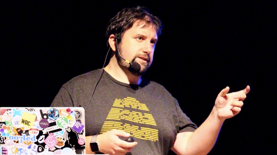
Helping you get the most out of Design Systems!
Hello! I’m Stu, a Design Systems consultant and front-end developer with over a decade of experience in transforming workflows.
I’m passionate about simplifying processes and fostering collaboration through effective Design Systems and scalable front-end architecture.

I’ve collaborated with organizations like Monotype, UCL, EMBL, and Springer Nature, gaining insights into the value of robust Design Systems for boosting teamwork and delivering consistent user experiences. My focus is on building systems that provide clarity and consistency, ensuring alignment with your business goals.
I’d love to chat about how we can work together to elevate your projects and streamline your processes.
How I Can Help You
I help teams create efficient, scalable systems that streamline workflows and enhance consistency across industries. With technical expertise and practical insights, I build cohesive, maintainable solutions, emphasizing collaboration, clarity, and adaptability in both front-end architecture and integrated design systems.
Front-End Architecture
I focus on creating maintainable and scalable front-end architectures.
-
Establish coding standards and best practices.
-
Conduct audits to identify areas for improvement.
-
Optimize performance for a seamless user experience.
-
Document architecture to ensure clarity and collaboration.
Design Systems
I collaborate to build cohesive Design Systems that enhance user experience.
-
Develop and maintain design tokens for consistency.
-
Streamline updates across platforms.
-
Prioritize accessibility in design decisions.
-
Facilitate communication between designers and developers.
Workshops & Speaking
I lead workshops and share insights to foster continuous improvement.
-
Conduct training sessions on best practices and tools.
-
Present at conferences to inspire industry peers.
-
Promote awareness of web performance and accessibility.
-
Encourage knowledge sharing among team members.
Success Stories
Over the years, I’ve collaborated with various organizations to tackle complex challenges in design systems, design tokens, and front-end architecture. My focus has been on creating cohesive systems that deliver consistency and scalability across platforms. The following success stories showcase key projects where I’ve helped deliver impactful solutions, streamline workflows, and enhance user experiences.
UCL
At UCL, I worked to improve their digital experience through a series of design system enhancements, including:
- Designed a site-wide search system based on provided wireframes.
- Created all components and patterns using existing design system tokens.
- Developed new components and patterns to extend their design system.

Monotype
At Monotype, I contributed to shaping their design systems and digital tools through several impactful initiatives, including:
- Led the creation and development of Monotype’s Marketing Design System.
- Developed tooling for component creation and type specimen page generation.
- Provided development support for Monotype’s Shopify storefront.
- Extended the Design System for their subscription service.

EMBL
At EMBL, I was instrumental in establishing their new design system language and front-end architecture. My work involved:
- Collaborated with the Digital Design team to define the design system language.
- Developed the front-end architecture for the Design System.
- Worked with stakeholders to align naming conventions, component structures, and system consistency.
- Created documentation for smooth handover and future development.

Springer Nature
At Springer Nature, I contributed to multiple initiatives during technical updates, including:
- Assisted with front-end work during server migrations and back-end updates across several sites.
- Joined the new Design System team to focus on front-end development.
- Worked on the creation of a new Design System documentation site.
- Introduced design tokens to standardize and streamline design implementation.
- Upgraded the CSS for typography across key properties using design tokens.
- Created tooling to ensure consistent design token usage across components.
